Redesigning my website
April 15, 2021 • 9 min read
Table of Contents
Intro
Sometimes, when I feel overwhelmed over certain things (could be work, university or just life in general), I tend to look up for things I can get my head busy into, just so I get focused on more important and meaningful things rather than the overwhelming stuff.
I've been looking into multiple personal websites recently and have also had this thought that my website was slightly kinda boring, and it deserved to be looking better to make it more attractive.
I thought it would be great to re-do everything from scratch. I was thinking of using this portfolio starter project but after looking into it, I decided not to do so because I find RSS unnecessary as I don't really blog too much, learning and then using MDX and Nextra would require quite some time, plus getting the base project to look as my current website, plus adding all sections and stuff, would require another big amount of time.
At the end, I realized my website wasn't really looking bad or anything, it just needed a few things to make it more vivid and whatnot.
Design Changes
Toolbar links and section titles
While exploring Brian Lovin's bookmarks I came accross with Julie Chabin's website and thought the gradient in links and dividers looked pretty cool 🤩
So I wanted to implement them in my website. At first, I thought of showing the gradient only when the link was highlighted in the toolbar, but it felt weird when being around items without the gradient, so I ended up applying it to all the links. I decided to do it subtly so the gradient looks like it goes all the way through the toolbar.
Then I started working on the gradient for titles. I did it while using the dark theme of my website, and when I switched to the light theme, I noticed the titles had a text shadow. 😮 How long had I not been working on my website that I forgot about that? idk 😬
Anyways, I still liked that, and thought it was fine to keep, but then I also wanted the gradients, so my solution was to keep gradients in titles while using the dark theme only. They look better with a dark background anyways.
Here's a quick comparison:


If you're wondering how to apply a gradient to text, you can do so like this:
.text-gradient {
  --gradient-start-color: #2d52ab;
  --gradient-end-color: #247aae;
  background: var(--gradient-start-color);
  background: -moz-linear-gradient(
    90deg,
    var(--gradient-start-color) 0%,
    var(--gradient-end-color) 100%
  );
  background: -webkit-linear-gradient(
    90deg,
    var(--gradient-start-color) 0%,
    var(--gradient-end-color) 100%
  );
  background: linear-gradient(
    90deg,
    var(--gradient-start-color) 0%,
    var(--gradient-end-color) 100%
  );
  -webkit-background-clip: text;
  background-clip: text;
  -webkit-text-fill-color: rgba(0 0 0 0);
  color: rgba(0 0 0 0);
}
You can also generate the gradient background using cssgradient.io
Less bloated introduction
Previously, the first section of my website included a bunch of text that I was thinking wasn't really necessary to be there and didn't really say much about me. So I removed a couple paragraphs to make it more straight to the point.
Now it just shows:
- a pretty short description of me
- the place I'm currently working at and my position
- a slightly longer description
Less social links
Also, it used to show like 8 different social networks, including a contact button. I decided to just leave the ones I'm most active in, and for contacting, you can already access that from toolbar 😅
Projects section
Just a couple of months ago I changed the projects section in my website, also inspired by Julie Chabin's website where the projects card had a gradient background and a preview of the project.
The design was ok, but also slightly boring, also the cards occupied too much vertical space that probably wasn't needed. So I decided to put the text above the image, inside the card, and also make the card slightly smaller in height. Then the text was covering part of the project preview, and it was getting slightly hard to read, so I moved the image a bit.
Comparison:
Finally, I added a link to my resume in the projects section, because even though I'm not actively looking for new job opportunities, I like to know of any available positions which might take my career to the next step.
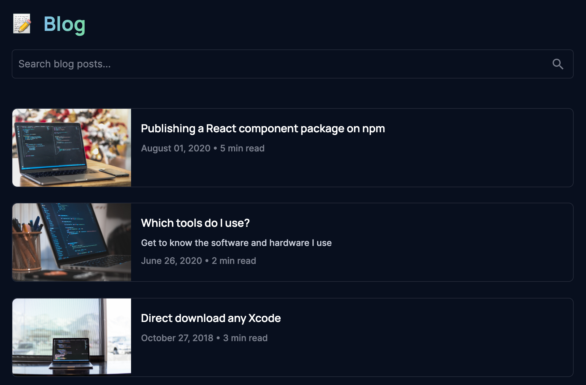
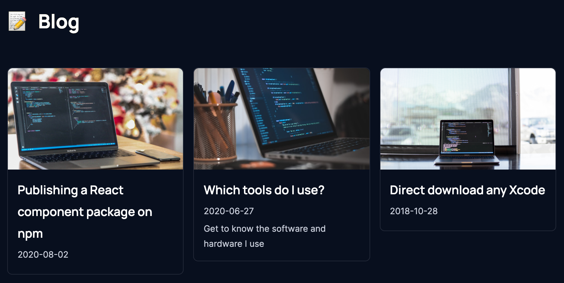
Blog page
My blog page had a similar issue as the projects section: cards where too big and took too much vertical space. Also, I probably was making the hero images more important than the post title or description. That's why I decided to make them way smaller and the content now goes horizontally.
Based on Lee Robinson's website I added reading time info for every post that lives in my website (does not apply to external ones) and also a search bar.
Reading time is done using the reading-time package, which works with plain text, markdown and html.
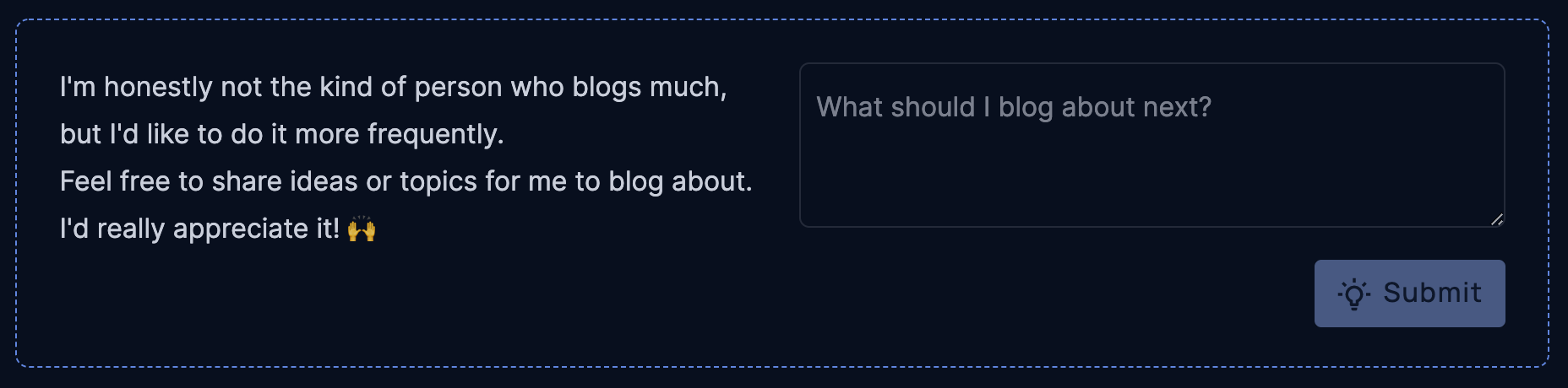
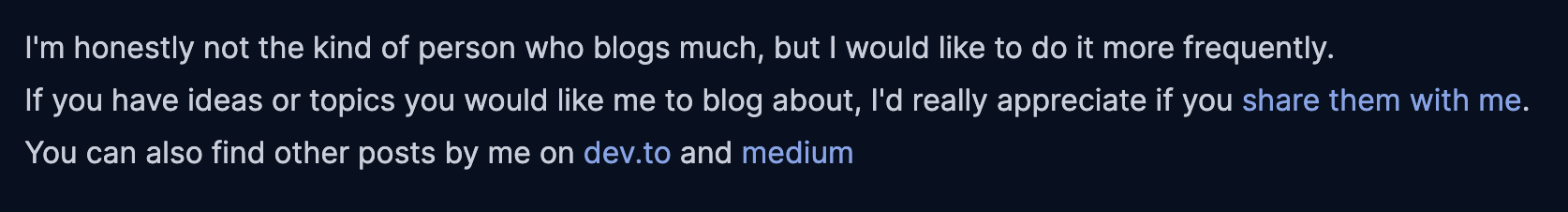
Based on Brian Lovin's website I updated the post date to make it easier to read and added a quick form for people to share ideas of things they think I should blog about, that way, it also becomes more interactive than before and they don't need to go to the contact site and fill unnecessary fields.
Here's the comparison:
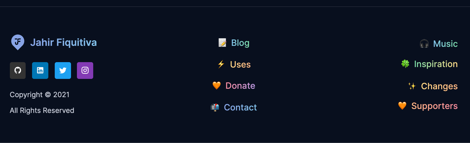
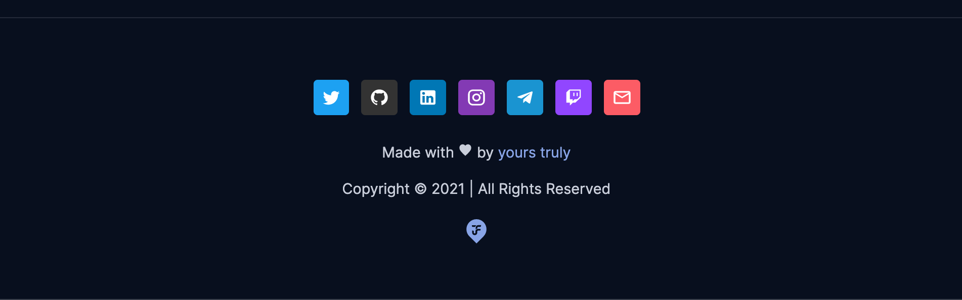
Footer
I went from simple to useful with the footer. Lee Robinson's website's footer includes links for the main sections of the site, but also some extra "hidden" ones.
I also applied text gradients here, and now it helps people navigate more easily through the different sections of my website.
Comparison:
New Features
Table of contents
While viewing some blog posts in Lee Rob's website, I noticed many of them included a table of contents, which I think might be useful when going through long blog posts just like this one 😅
I started checking how he did it and found a snippet to do it with MDX. The problem was: I don't use MDX in my website. Therefore, decided to code it myself, and here it is.
export const getTableOfContents = (body?: string): string | null => {
  if (!body || !body.length) return null;
  // Split markdown body line by line
  const lines = body
    .split(/\r\n|\n\r|\n|\r/)
    // Get only the lines that start with # aka the titles
    .filter((it) => it.trim().startsWith('#'));
  let mainTitle = '';
  // Find the title with the less amount of #
  for (const line of lines) {
    const titleHashtags = line.trim().substring(0, line.lastIndexOf('#') + 1);
    if (titleHashtags.length < mainTitle.length || mainTitle.length <= 0) {
      mainTitle = titleHashtags;
    }
  }
  let titleIndex = 0;
  const tableOfContents = lines
    .map((line) => {
      // Remove the main title part
      let title = line.substring(mainTitle.length).trim();
      let indent = '';
      // If the title does not start with #, then it's one of the main ones, so it's numbered
      if (!title.startsWith('#')) {
        titleIndex += 1;
        // The indent isn't really an indent but rather an item numeration
        indent = `${titleIndex}. `;
      } else {
        // Otherwise, indentation is needed, so I add two spaces per every # in the title,
        // plus 2 extra ones at the beginning because these are nested items
        const split = title.split('#');
        title = split.pop()?.trim() ?? '';
        indent = `   ${split.join('  ')}* `;
      }
      if (!title || !title.length) return null;
      // Generate the link slug, where the title will point to, by replacing non word
      // characters with a dash
      const slug = title.toLowerCase().replace(/\W/g, '-');
      return `${indent}[${title}](#${slug})`;
    })
    .filter((it) => it && it.length > 0);
  return tableOfContents.join('\n');
};
Code Syntax Highlighting
Lee Rob's posts also included pretty code snippets. I didn't really consider this before, because I was thinking of using dev.to to publish blog posts, but then I also thought it would be nice to have them right on my own website, and I started looking into how to implement that.
I used React Syntax Highligther along with React Markdown and a custom syntax theme to achieve that, although is based on Lee Robinson's one.
Security headers
I just followed Lee Robinson's guide in Twitter.
Self-hosted fonts
Following Lee Robinson's guide and suggestions I have now set my website to host the fonts files itself, aiming to improve their performance.
I used this Google WebFonts Helper tool to download only the font files and config I needed.
Music dashboard
The music dashboard is a new place in my website, where you can know a little more about me by seeing what I'm currently listening to and also the most recent top tracks.
To achieve this I used Lee Robinson's snippets to get the song I'm currently listening to, and also the top tracks. And additionally used react-palette to get colors from the song's album and show a more vivid interface.
Inspiration links
Based on Brian Lovin's bookmarks I wanted to share some links to websites or tools that have been inspiring my work and even some of my projects. Probably not enough to recognize their work and quality and creativity in what they do.
I'm using the Favicon Grabber API and WebMaster API to get the sites favicons. The latter is used just in case the first one fails.
Closing up
Well, this has become a really long blog post. I just wanted to explain the process I went through, the decisions I took, and also mention the parts I took most inspiration from to do this.
I hope you enjoyed this post. See ya 👋